iOS 15’s Notification Summary and the Product Values Behind It
Estela Young

全文共 1901 字,阅读需 10 分钟 Worth Reading The long‑awaited iOS 15 was announced on June 8 at Apple’s 2021 Worldwide Developers Conference. As an ordinary user, I only saw the new iOS 15 f...

全文共 1901 字,阅读需 10 分钟
Worth Reading
The long‑awaited iOS 15 was announced on June 8 at Apple’s 2021 Worldwide Developers Conference.
As an ordinary user, I only saw the new iOS 15 features in the “Tips” app in September. To be honest, I didn’t feel much at the time. Later, after learning about the “Notification Summary” feature during a product research project and using it extensively, I genuinely think it’s a fantastic addition—calling it the best feature of this release (no exaggeration) isn’t an overstatement.
As a user‑focused product manager, the product values and design thinking behind “Notification Summary” are worth every product professional’s study and reflection.
Hence, I wrote this article.
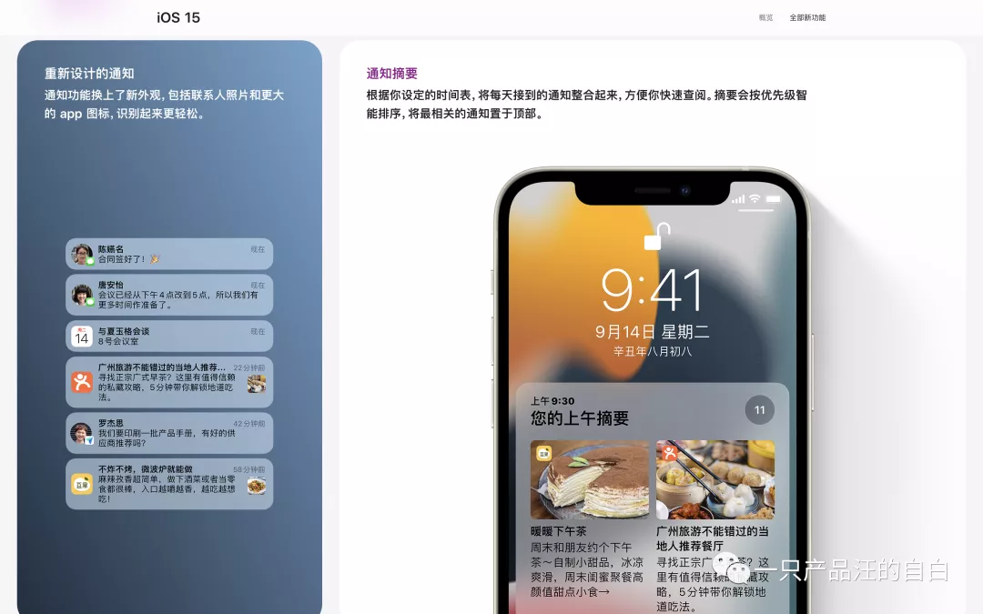
01 What Is “Notification Summary”
iOS 15 brought improvements to many apps—FaceTime, Notifications, Photos, Weather, Wallet, Maps, and more—so notifications might not be the most eye‑catching change.
According to the iOS 15 website, notifications received two upgrades:
- A fresh look: contact photos and larger app icons make it easier for users to recognize who or what the notification is from.
- The “Notification Summary” feature: based on a schedule you set, the system bundles the day’s notifications into a single summary for quick review. Summaries are intelligently ordered by priority, putting the most relevant alerts at the top.
In short, you go to Settings → Notifications → Scheduled Summary to choose the time you want to receive the summary and which apps are included. At the scheduled time, the system pushes all messages from that period; if an app has multiple messages, they are collapsed.
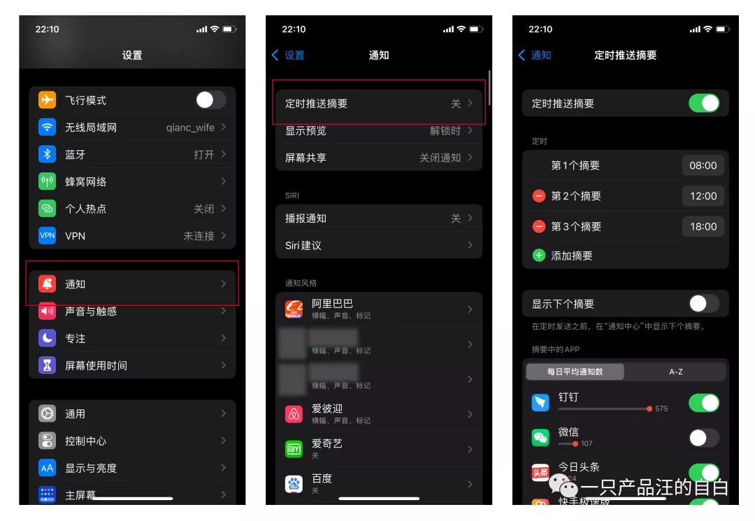
For me, everything except China Merchants Bank, Alipay, SMS, and WeChat is set to appear in the summary—including DingTalk (most of its messages I already read on the desktop client).
The end result can be seen in the video below (the DingTalk portion is blurred for work‑related reasons).
It’s also worth noting that the Scheduled Summary settings show how many notifications each app sends per day. In my case, DingTalk tops the list, followed by WeChat, then Toutiao (which, unbelievably, sends 24 notifications a day—once you count them, it’s a shock).
02 Why Apple Created “Notification Summary”
Modern life is inseparable from smartphones; some even say the phone has become a human organ—a statement that isn’t an exaggeration.
Because phones intrude so deeply into personal life, time becomes endlessly fragmented. People are interrupted more often, their attention spans shrink, and consequently work and study efficiency drops. That’s the flip side of the high‑tech coin.
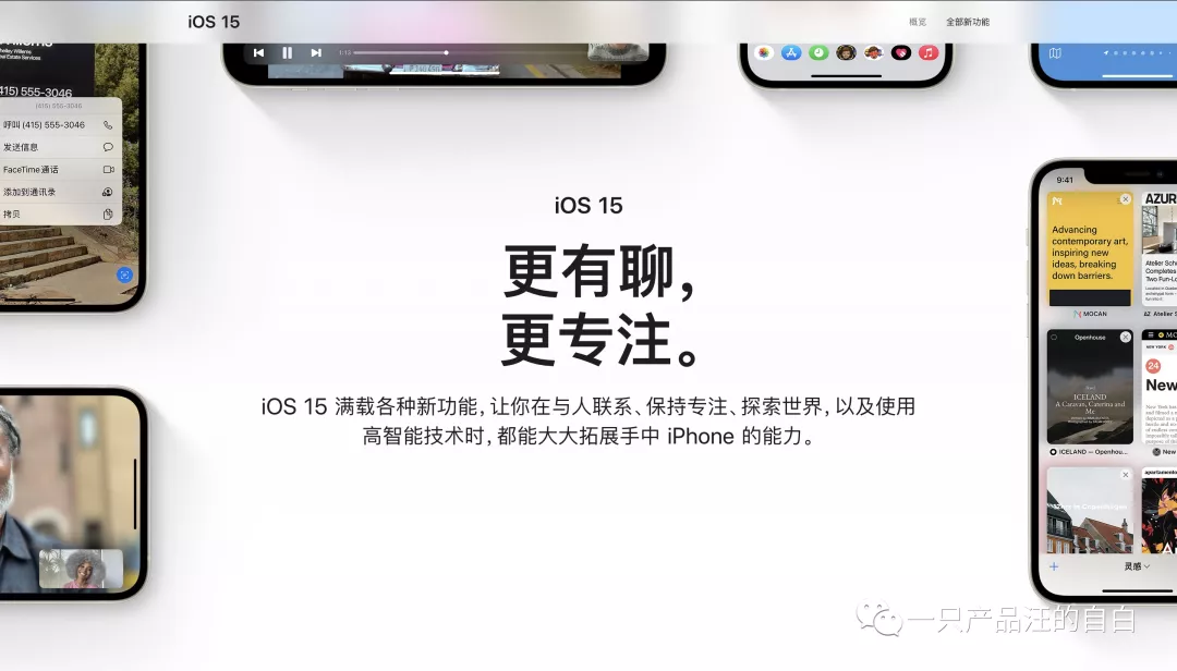
Against this backdrop, Apple’s introduction of Focus Mode and Notification Summary makes perfect sense. It aligns with iOS 15’s theme: “More conversation, more focus.”
From my personal experience, the summary feels great: the number of interruptions while working drops dramatically. By checking messages at set times, I never miss anything important (and sometimes missing a trivial notification isn’t a big deal).
In a word, no longer feeling “summoned” by constant alerts is incredibly refreshing!
03 The Product Values Behind “Notification Summary”
Although the feature is modest, the deep product values it reflects are worth pondering.
On one hand, it shows Apple’s commitment to user experience and its advocacy of positive values.
Here, “user experience” does not mean designing for “users” as a KPI metric (e.g., page views, session length) nor merely catering to base human instincts (which tend toward instant gratification). Instead, it means designing for people—recognizing that users, as human beings, have intrinsic needs for self‑development and growth, and helping them manage themselves better.
On the other hand, it reveals Apple’s unconventional design thinking.
Typically, when faced with “too many messages may disturb users,” the common approach is to block: categorize message types, limit the number of notifications an app can send per day, lower the priority of apps with high opt‑out rates, and so on.
Apple, however, takes a different route with a top‑level aggregation strategy. This cleverly avoids the endless cycle of “blocking the west wall, then the south wall—blocking forever,” and instead hands control of message management over to the user, trusting their judgment and fully respecting their preferences. That’s a powerful move.
A similar design philosophy appears in WeChat’s group‑chat folding feature—feel free to try it out if you’re curious.
04 Final Thoughts
Good product design satisfies basic functional needs and builds an emotional and value‑based connection with users: they like you for some reason, or they resonate with the philosophy behind you.
It’s not hard to see: I follow a B‑station creator because I enjoy her content (functional need), we’re close in age and share similar vibes (emotional link), and I admire her approach to life (value alignment).
This reminds us that beyond core functionality, we must consider what values we want to convey through our product. That mindset yields a more lasting design than features alone.
Let’s keep striving together.
Reference: iOS 15 official site – https://www.apple.com.cn/ios/ios-15/
WeChat public account: A Product Dog’s Confession
Sharing product insights, reading notes, and more.
Follow us via QR code to stay connected.

Originally written by Estela Young and published in Chinese on 一只产品汪的自白. Translated and edited for DriftSeas with permission.